
Pay attention to street signs as you drive around town, and it won’t take you long to notice some of them are in rough shape. The signs are peeling, and in a number of cases, street names are no longer discernible. Many of you have been wondering why they haven’t been replaced. I sat down with DPW Superintendent Karen Galligan last week to find out.
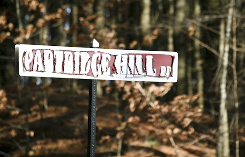
The town moved to the current maroon signs sometime around 2001, Galligan told me, but the material used to create the maroon background has not held up well. In particular, south-facing signs have peeled and chipped.
The signs are no longer under warranty from the manufacturer, but turns out that might be a moot point since due to new state regulations, the town will likely have to replace all its street signs in the near future.
Galligan said the state is close to adopting a new standard for street signs, and maroon is no longer an approved background color. The new standard also calls for using uppercase and lowercase letters for improved readability instead of our current all-uppercase lettering.
The DPW has been keeping a list of signs that are in particularly bad shape and will replace those ones first. Galligan said they will likely start replacing signs with the new standard this spring, with the work continuing as budgets allow over the next few years.
But before the DPW can start replacing signs, Galligan said she needs to pick a new sign color. The state-approved options are green, blue, brown, or white. Too bad flamingo pink didn’t make the list.

Ah you beat me to it w/ the pink joke :-) Is the Newton St. sign by the Marlborough Savings Bank on the list? It’s still the old white on green….
just an opinion but the Ashland street signs are very readable and seem to be holding up well…..
Hey… You stole my “flamingo” comment!! Glad you are enjoying it!
I did! It was one of my favorites. Did you see it made it onto the sign at the Transfer Station? Clearly I wasn’t the only one who like the suggestion!
It really is too bad that the street signs didn’t hold up better. We moved to Southborough in 2004 and I can remember signs being replaced after we moved here. Maybe the process started in 2001 but I think the actual replacement was more recent. I am surprised that the signs are already not under warranty. That seems to be a short warranty for something that should last a lifetime. This is not a criticism, just a comment. I grew up in a small town in NY and don’t remember the street signs ever bring replaced. They were boring old black on white but were always completely legible. It’s just a shame that Southborough’s signs were such poor quality. Just my thoughts. Maybe “flamingo” would have been better :)
That’s a bummer. I like our maroon signs – well, the ones that aren’t peeling. I like that they are distinctively Southborough and you know when you cross over from one town into another. Considering how directionless I am, I find that pretty useful!
I think Ashland, Marlborough, and Framingham all have white on blue, so I’d like to see something different. I can’t remember – what does Westborough have? Northborough?
Maybe white on brown would look classic and have a historical air to it.
But in the end – they are street signs – so let’s make sure they’re readable. ;-)
Distinctly Southborough? Yeah, that is one way to describe ugly, peeling signs. I hope whomever “designs” the signs keeps a couple of very basic graphic rules in mind:
• Initial caps (upper and lower case) are more legible than all upper case.
• Unless you are using just black on white, the dark color should be the background and type should be white… I like the brown idea… something different than neighboring towns.
• And, for pity’s sake CHANGE THAT FONT! The typeface is awful! Just use a simple, easy-to-read san serif typeface.
I would want ALL signs to have the street name on BOTH sides. I have noticed that some street names are only printed on one side of the sign. I suspect the thinking was that if you cannot access the street from one side then the name is not necessary on that side of the sign? It is still helpful to know a street name even if I am reading it from the “back” side of the sign. I think the traditional black on white looks classic and historical.
Is this company still in business? Can we at least leave feedback with the BBB or yelp to let others know their products are inferior? The short life-span of the signs is inexcusable.
Another comment on the ugly street signs is the use of “fake” bold type… where the real bold type face isn’t in the system, and the person just bolded the book face…looks horrible, and anyone who knows what they’re doing should know better.
Change the font to one that is readable!
And spell check… I believe McNeil Drive is spelled 2 different ways on the front and back of the sign?